
Quiet Luxury 2.0: The Devil is in the Details


Clashing textures is the definition of modern luxury. As a follow-up to my post about the Quiet Luxury phenomenon, I want to expand on the concept (as well as the looks) and dive a little deeper.
The concept of Quiet Luxury is clothes that make a statement without screaming for attention. And IMHO, quiet luxury is built around the idea of great basics that do a lot of the wardrobe heavy lifting - you know, those items that look really nice and you can wear over and over but won’t necessarily be remembered, because they’re classics.
And one of the arguments surrounding quiet luxury is that it can feel rather dull. Sometimes, basics can just feel kinda, ya know, basic.
That’s where Quiet Luxury 2.0 comes in…
The idea behind quiet luxury 2.0 is that the little details, the quiet details are what add interest to the outfit. So, for example, an all all-black outfit could read a bit blah. But if you clash the textures in an all-black outfit it goes from basic to brilliant with ease. It’s similar to the rule of juxtaposition, but in a more subtle way.
Let’s dissect how to actually do it, with one of my favorites for quiet luxury - ME+EM! This post was sponsored by ME+EM, but as always, I only work with brands that I truly love and wear.
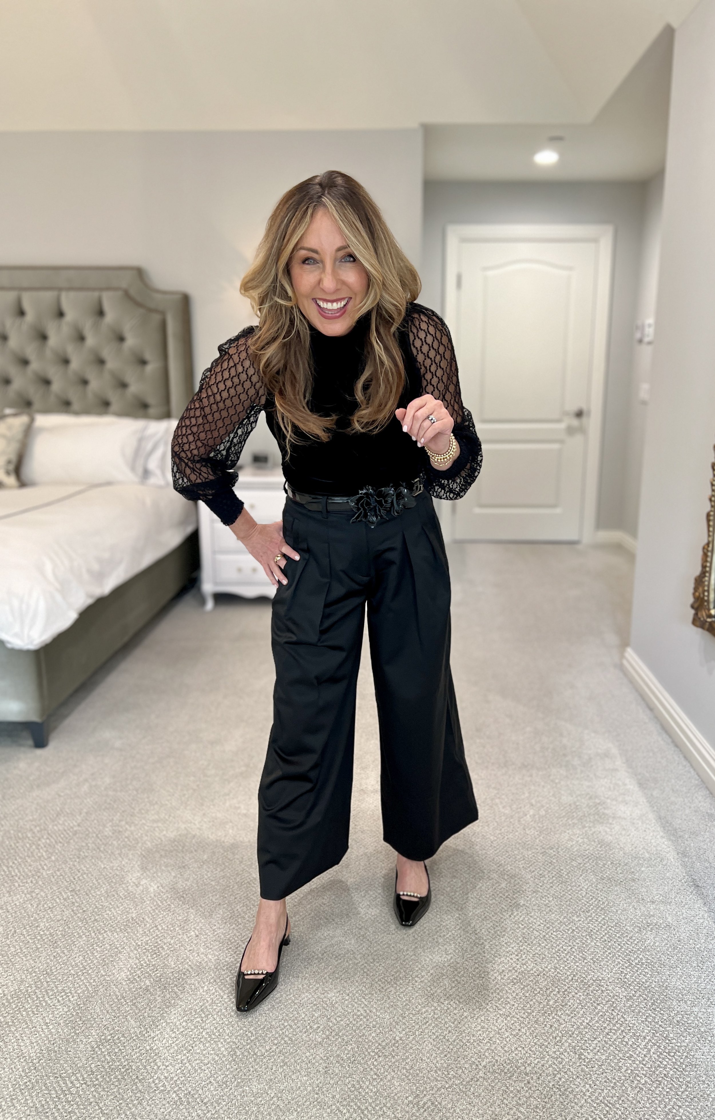
Clashing Textures: All Black
Let’s take this all black outfit - that would be perfect for a holiday party by the way. The silhouette is lovely, a slim top with a puff sleeve, balanced by a fuller pant leg. However, what makes this outfit truly special (both on film and in real life) is how the textures mix to add depth to an otherwise all black outfit. It’s that clash of textures - velvet, lace, satin and patent - that uplevel the look. If there was not that texture clash, the outfit could feel very one note. The interest is subtle and quiet, while also being very apparent.
And that, my friends, is how quiet luxury 2.0 is done.
Now, if you like the concept of quiet luxury and also like color, how do you make that work…
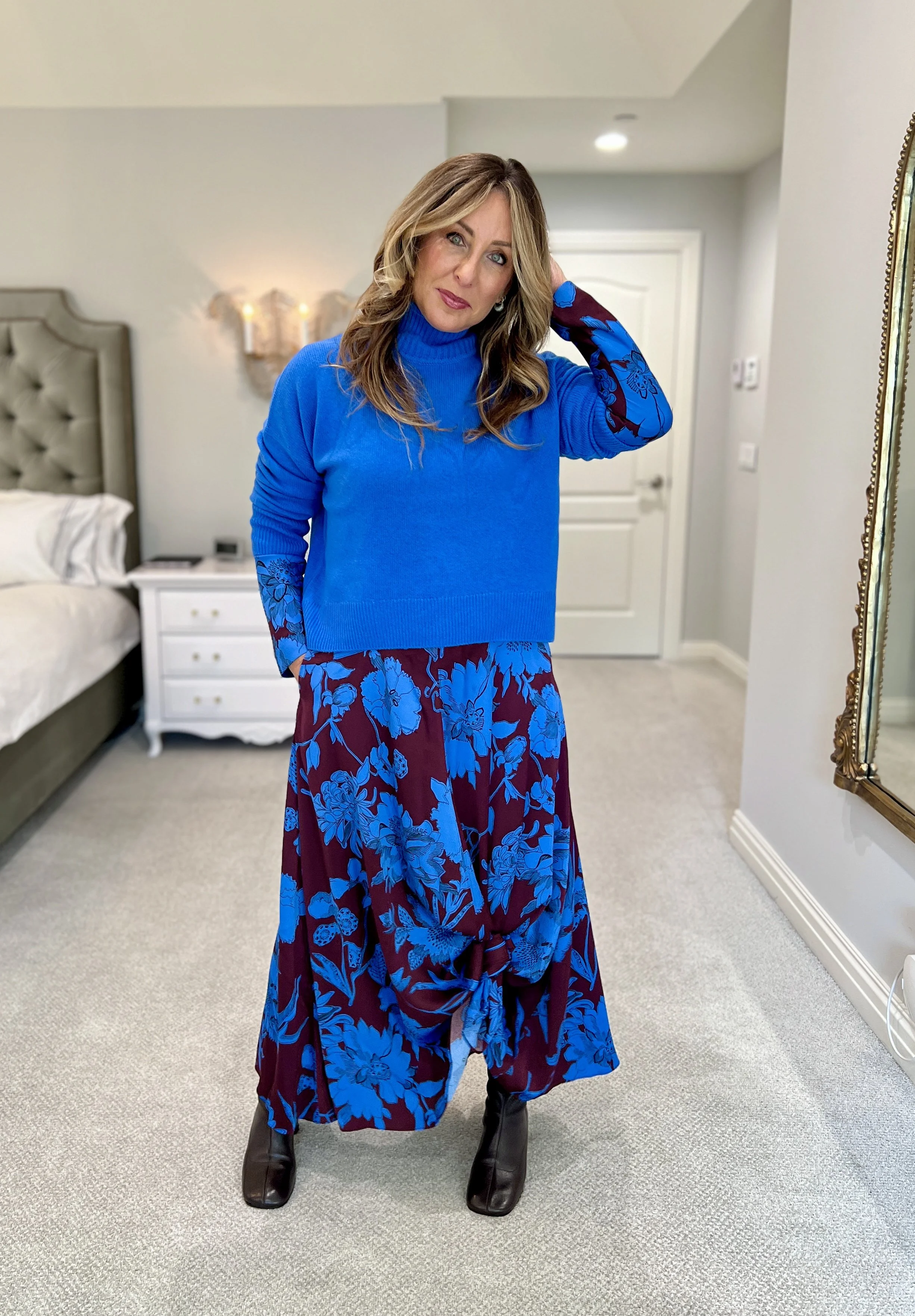
Clashing Textures: Color
It’s another twist on the Quiet Luxury 2.0 concept. The goal is to create interest and depth in the outfit, but in a way that is somewhat held back and restrained. As opposed to a more is more approach, it is the adding just a touch and then pulling back the reins that gives the outfit wow.
This floral outfit embraces color, but it is a somewhat controlled expression of color. Using only two colors, in deeper tones, gives this print excitement. And staying away from the expected dark color of black and opting for a deep plum/cabernet, also ups the ante. Lastly, clashing a heavy weight satin fabric with a chunky knit sweater gives the outfit that friction that intrinsically creates modern quiet luxury 2.0.


Shop Quiet Luxury Pieces:
